
티스토리 뷰
영어 공부와 iOS 공부를 위해서 apple 개발자 문서를 번역한것입니다.
공부하는 중에 번역한 것이라서 오타나, 잘못된 부분이 있을 수 있습니다.
Understanding Auto Layout
Auto Layout dynamically calculates the size and position of all the views in your view hierarchy, based on constraints placed on those views. For example, you can constrain a button so that it is horizontally centered with an Image view and so that the button’s top edge always remains 8 points below the image’s bottom. If the image view’s size or position changes, the button’s position automatically adjusts to match.
This constraint-based approach to design allows you to build user interfaces that dynamically respond to both internal and external changes.
Auto Layout은 그 화면들에 발생된 제약사항을 기반으로 하여 화면의 계층안에서 모든 화면의 위치와 크기를 계산한다. 예를 들어서 당신은 하나의 버튼을 다음과 같이 제약할 수 있다. 하나의 버튼이 가로의 중간에 위치하면서 그 버튼의 윗면이 하나의 이미지의 바닥면을 기준으로 8포인트 남겨두고 위치하도록 제약 할 수 있다. 만약 이미지 뷰의 크기 또는 위치가 변한다면, 그 버튼의 위치는 자동적으로 조정될 것이다.
이러한 제약사항을 기반으로한 접근은 당신이 사용자 인터페이스를 내부, 외부적 변화에 의해서 다양하게 응답하도록 구성하는 것을 허락한다.
External Changes
외부 변화
External changes occur when the size or shape of your superview changes. With each change, you must update the layout of your view hierarchy to best use the available space. Here are some common sources of external change:
외부변화는 당신의 상위 뷰의 크기, 모양의 변화가 발생할때 발생한다. 개별 변화에 대해서 당신은 당신의 뷰계층의 레이아웃을 이용가능한 공간을 최선의 방법으로 업데이트 해야한다. 여기에 일반적인 외부변화가 나와있다.
The user resizes the window (OS X).
The user enters or leaves Split View on an iPad (iOS).
The device rotates (iOS).
The active call and audio recording bars appear or disappear (iOS).
You want to support different size classes.
You want to support different screen sizes.
사용자가 윈도우를 재조정한다.
사용자가 분활화면을 시작 또는 종료한다.
기기의 가로, 세로모드가 변경된다.
통화중이거나 오디오 녹음 바가 나타나거나 사라진다.
당신이 다양한 크기의 계층을 지원하고 싶다.
당신이 다양한 화면 크기를 지원하고 싶다.
Most of these changes can occur at runtime, and they require a dynamic response from your app. Others, like support for different screen sizes, represent the app adapting to different environments. Even through the screen size won’t typically change at runtime, creating an adaptive interface lets your app run equally well on an iPhone 4S, an iPhone 6 Plus, or even an iPad. Auto Layout is also a key component for supporting Slide Over and Split Views on the iPad.
대부분의 이러한 변화는 작동 시의 발생할 수 있다. 그리고 그들은 다양한 응답을 당신의 앱으로 부터 요구할 것이다. 다양한 화면 크기를 지원하는 것은 다른 환경에 적응하는 앱으로 표현된다. 일반적으로 작동시에 화면 사이즈가 변화하지 않을지라도 적응형 인터페이스를 만드는 것은 당신의 앱이 아이폰4s, 아이폰 6 플러스, 심지어 아이패드에서도 동일하게 작동하게 해준다. Auto layout은 또한 아이패드에서 슬라이드 오버와 화면 분활 기능을 제공하는 핵심 요소중 하나이다.
Internal Changes
내부 변화
Internal changes occur when the size of the views or controls in your user interface change.
내부 변화는 당신의 사용자 인터페이스에서 윈도우 크기 또는 사용자의 제어가 변경 되었을때 발생한다.
Here are some common sources of internal change:
여기에 몇가지 일반적인 내부 변화 예가 있다.
The content displayed by the app changes.
The app supports internationalization.
The app supports Dynamic Type (iOS).
앱의 변화에 의해서 내용이 표시될때
앱에서 국제화(다국어, 다문화)를 지원할때
앱에서 다양한 형식을 지원할때.
When your app’s content changes, the new content may require a different layout than the old. This commonly occurs in apps that display text or images. For example, a news app needs to adjust its layout based on the size of the individual news articles. Similarly, a photo collage must handle a wide range of image sizes and aspect ratios.
당신의 앱의 내용이 변했을때, 새로운 내용은 이전과 다른 레이아웃을 요구한다. 이것은 일반적으로 앱에서 문자나 이미지를 표현할때 발생한다. 예를 들어서 한 뉴스 앱은 개별뉴스 기사의 크기에 따라서 레이아웃을 조정할 필요가 있다. 유사하게 사진 콜라주는 다양한 사진의 크기, 비율을 다루어야 한다.
Internationalization is the process of making your app able to adapt to different languages, regions, and cultures. The layout of an internationalized app must take these differences into account and appear correctly in all the languages and regions that the app supports.
국제화는 당신의 앱을 다른 문화, 지역, 언어에 적응할 수 있도록 만드는 과정이다. 국제화된 앱의 레이아웃은 이러한 차이점을 계정안에 갖고 있어야 하며, 앱에서 지원하는 모든 언어와 지역에 올바르게 나타나야한다.
Internationalization has three main effects on layout. First, when you translate your user interface into a different language, the labels require a different amount of space. German, for example, typically requires considerably more space than English. Japanese frequently requires much less.
국제화는 레이아웃에 3가지 주된 영향을 준다. 첫번째는 당신이 당신의 사용자 인터페이스를 다른 언어로 번역할때, 해당 라벨은 다른 양의 공간을 요구할 것이다. 예를 들어서 독일어의 경우 영어보다 많은 공간을 요구하고, 일본어의 경우 더 적은 공간을 요구한다.
Second, the format used to represent dates and numbers can change from region to region, even if the language does not change. Although these changes are typically more subtle than the language changes, the user interface still needs to adapt to the slight variation in size.
두번째로, 언어가 변경되지 않더라도 날짜와 숫자 표현 형식은 지역에 따라서 숫자와 날짜 표현 방식은 변할 수 있다. 일반적으로 언어의 변화보다는 약하지만 사용자 인터페이스는 여전히 이런 약한 크기의 다양성에 적응해야할 필요가 있다.
Third, changing the language can affect not just the size of the text, but the organization of the layout as well. Different languages use different layout directions. English, for example, uses a left-to-right layout direction, and Arabic and Hebrew use a right-to-left layout direction. In general, the order of the user interface elements should match the layout direction. If a button is in the bottom-right corner of the view in English, it should be in the bottom left in Arabic.
세번째는, 언어의 변화가 문자의 크기 뿐만 아니라 레이아웃의 구성에도 영향을 줄수 있다는 것이다. 다른 언어는 다른 레이아웃 방향을 사용한다. 예를 들어서 영어는 왼쪽에서 오른쪽으로 방향을 갖는다. 그리고 아랍어, 히브리어는 오른쪽에서 왼쪽으로 레이아웃 방향을 사용한다. 일반적으로 사용자 인터페이스 요소의 순서는 이러한 레이아웃 방향과 일치해야한다. 만약 하나의 버튼이 영어에서 오른쪽 아래에 위치하고 있다면 아랍어에서는 왼쪽 아래에 위치해야한다.
Finally, if your iOS app supports dynamic type, the user can change the font size used in your app. This can change both the height and the width of any textual elements in your user interface. If the user changes the font size while your app is running, both the fonts and the layout must adapt.
마지막으로, 만약 너의 iOS 앱이 다양한 형식을 지원한다면, 사용자는 앱에서 사용되는 글자 크기를 변경할수 있다. 이것은 당신의 사용자 인터페이스의 모든 문자와 관련된 요소들의 높이와 넓이 모두에서 변화 할 수 있어야 한다. 당신의 앱을 사용하는동안 사용자가 글자 크기를 변경하면, 글자와 레이아웃은 모두 적응해야 한다.
Auto Layout Versus Frame-Based Layout
자동 레이아웃과 프레임 기반 레이아웃 비교
There are three main approaches to laying out a user interface. You can programmatically lay out the user interface, you can use autoresizing masks to automate some of the responses to external change, or you can use Auto Layout.
사용자 인터페이스에 대한 주된 3가지 접근 방식이 있다. 당신은 사용자 인터페이스를 프로그램적으로 구성할 수 있으며, 외부 변화에 대해서 자동으로 몇개의 응답을하는 자동크기변화 마스크를 사용할 수 도있다. 또는 자동 레이아웃을 사용할 수 있다.
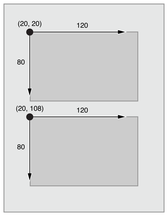
Traditionally, apps laid out their user interface by programmatically setting the frame for each view in a view hierarchy. The frame defined the view’s origin, height, and width in the superview’s coordinate system.
전통적으로, 앱은 사용자 인터페이스를 화면 계층구조 안에서 개별 화면에 대한 프레임을 프로그램적으로 정의하는 방식으로 레이아웃을 구성한다. 이 프레임은 상위 화면의 좌표계에 대해서 시작점, 높이, 넓이를 정의한다.
다음 그림의 첫번째 사각형의 시작점은 (20,20), 넓이는 120, 높이는 80이다.
To lay out your user interface, you had to calculate the size and position for every view in your view hierarchy. Then, if a change occurred, you had to recalculate the frame for all the effected views.
사용자 인터페이스를 구성하기 위해서, 당신은 화면 계층안에 있는 모든 뷰의 크기와 위치를 계산해야만 한다. 만약 변화가 발생한다면, 당신은 변화에 영향을 받은 모든 뷰에 대해서 다시 프레임을 계사해 주어야 한다.
In many ways, programmatically defining a view’s frame provides the most flexibility and power. When a change occurs, you can literally make any change you want. Yet because you must also manage all the changes yourself, laying out a simple user interface requires a considerable amount of effort to design, debug, and maintain. Creating a truly adaptive user interface increases the difficulty by an order of magnitude.
많은 경우, 프로그램적으로 프레임을 정의하는 것은 가장 유연하고 강함을 제공한다. 만약 변화가 발생하면, 당신은 문자적으로 당신이 원하는 어떤 변화에 대해서 만들 수 있다. 그러나 당신은 스스로 모든 변화에 대해서 관리해야하기 때문에, 단순한 사용자 인터페이스를 구성하는 것은 디자인, 디버그 그리고 유지에 많은 고려를 해야한다. 진정한 적응형 사용자 인터페이스를 구성하는 것은 크기에 따라서 어려움을 증가시킨다.
You can use autoresizing masks to help alleviate some of this effort. An autoresizing mask defines how a view’s frame changes when its superview’s frame changes. This simplifies the creation of layouts that adapt to external changes.
당신은 자동크기변화 마스크를 이용하여 이러한 노력을 경감시킬 수 있다. 하나의 자동크기변화 마스크는 하나의 뷰 그 상위 뷰 프레임이 변할때 해당 프레임이 어떻게 변할지 정의한다. 이것은 외부 변화에 적응하는 레이아웃 생산을 단순화 한다.
However, autoresizing masks support a relatively small subset of possible layouts. For complex user interfaces, you typically need to augment the autoresizing masks with your own programmatic changes. Additionally, autoresizing masks adapt only to external changes. They do not support internal changes.
그러나, 자동크기변화 마스크는 가능한 레이아웃들의 비교적 작은 집합을 지원한다. 복잡한 사용자 인터페이스를 위해서 당신은 전형적으로 자동크기변화 마스크와 함께 당신의 프로그래밍적 변화들이 증가해야할 필요가 있다. 게다가, 자동크기변화 마스크들은 외부 변화에 대한 적응만 가능하다. 내부 변화에 대한 지원은 하지 않는다.
Although autoresizing masks are just an iterative improvement on programmatic layouts, Auto Layout represents an entirely new paradigm. Instead of thinking about a view’s frame, you think about its relationships.
비록 자동크기변화 마스크들은 프로그래밍적인 레이아웃의 향상의 반복이지만, 자동 레이아웃은 완전히 새로운 패러다임이다. 화면의 프레임에 대해서 생각하는 대신 당신은 그것들의 관계에 대해서 생각해야 한다.
Auto Layout defines your user interface using a series of constraints. Constraints typically represent a relationship between two views. Auto Layout then calculates the size and location of each view based on these constraints. This produces layouts that dynamically respond to both internal and external changes.
자동 레이아웃은 당신의 사용자 인터페이스를 제약사항의 열거를 사용하여 정의한다. 제약사항은 일반적으로 두개의 뷰 간의 관계로 표현된다. 자동 레이아웃은 이러한 게약사항에 기반하여 각각의 뷰의 위치와 크기를 계산한다. 이것은 내부, 외부 변화 모두에 대한 다양하게 응답하는 레이아웃을 생산한다.
The logic used to design a set of constraints to create specific behaviors is very different from the logic used to write procedural or object-oriented code. Fortunately, mastering Auto Layout is no different from mastering any other programming task. There are two basic steps: First you need to understand the logic behind constraint-based layouts, and then you need to learn the API. You’ve successfully performed these steps when learning other programming tasks. Auto Layout is no exception.
특정 행동을 생산하기 위한 제약 사항 집합을 설계하는데 사용하는 로직은 절차지향 또는 객체지향 코드를 작성하는데 사용하는 로직과 다르다. 다행이, 자동 레이아웃을 배우는 것과 다른 프로그래밍을 배우는 일은 다르지 않다. 여기에는 2가지 단계가 있다. 첫번째는 제약사항 기반의 레이아웃 로직을 이해하는 것이 필요하고, 두번째는 API를 배우는 것이 필요하다. 당신이 다른 프로그램일을 배울때 이러한 단계를 성공적으로 수행했다. 자동 레이아웃도 예외는 아니다.
The rest of this guide is designed to help ease your transition to Auto Layout. The Auto Layout Without Constraints chapter describes a high-level abstraction that simplifies the creation of Auto Layout backed user interfaces. The Anatomy of a Constraint chapter provides the background theory you need to understand to successfully interact with Auto Layout on your own. Working with Constraints in Interface Builder describes the tools for designing Auto Layout, and the Programmatically Creating Constraints and Auto Layout Cookbook chapters describe the API in detail. Finally, the Auto Layout Cookbook presents a wide range of sample layouts of varying levels of complexity, you can study and use in your own projects, and Debugging Auto Layout offers advice and tools for fixing things if anything goes wrong.
이 설명의 나머지는 자동 레이아웃을 당신이 좀더 쉽게 배울수 있도록 설계되어있다. "Auto Layout Without Constraints"는 고차원적인 추상화(사용자 인터페이스의 배경이되는 오토 레이아웃의 생산을 단순화하는)를 기술한다.
"Anatomy of a Constraint"는 당신 스스로 오토레이아웃과의 성공적인 상호작용을 위해 당신이 이해해야할 배경 지식을 제공한다."Working with Constraints in Interface Builder"는 오토레이아웃 디자인을 위해 필요한 도구를 서술한다. 그리고 "Programmatically Creating Constraints"와 "Auto Layout Cookbook" 챕터에서는 상세한 API를 서술한다. 마지막으로 "Auto Layout Cookbook"은 다양한 수준의 복잡한 레이아웃을 당신이 당신의 프로젝트에서 스스로 사용하고 공부할수 있도록 다양하게 보여준다. 그리고 "Debugging Auto Layout"은 잘못 되고 있는 다양한 것들에 대한 수정 방법과 도구를 제공한다.
'Programming > iOS' 카테고리의 다른 글
| [iOS/swift] cocoapods - 라이브러리 관리 (구글 API 샘플테스트) (0) | 2016.12.08 |
|---|---|
| [iOS/Swift] Auto Layout Without Constraints 번역 (0) | 2016.10.01 |
| [IOS/Swift] Control Flow (if/for/switch) (0) | 2016.08.07 |
| [IOS/Swift] Collections - Dictionary / Set (0) | 2016.08.07 |
| [IOS/Swift] Collections - Array (0) | 2016.08.07 |